This post is a subset of a more comprehensive post
which quantifies why we should “Drill Here, Drill Now”.
For 4 out of 5 quarters (Q4 of 2006 - Q4 of 2007), global demand for crude oil exceeded global supply. In response, spot prices for crude oil rose steeply and rapidly.
In Q1 of 2008, global supply of crude oil significantly exceeded global demand. By Q3 of 2008, spot prices for crude oil began to drop. There appears to be a consistent 2 quarter lag time in the price response to the balance (or imbalance) between global demand and global supply.
The Balance Between World
Crude Oil Supply & Demand vs. Price
Click the image to enlarge it:
I personally created and uploaded the above chart using these sources:
Global Supply and Demand - this spreadsheet downloaded from this page
(6/10/08 version through 6/11/09 version)
Spot price of oil - this spreadsheet downloaded from this page
Note: The supply/demand imbalance never exceeded 0.8 million barrels per day (about the amount ANWR alone could have been producing if ANWR had been approved decades ago). It is reasonable to say that ANWR alone could have entirely prevented the price spike we saw in the summer of 2008.
Click the image to enlarge it:

Source: Click here
World Growth in Demand For Oil
(Updated on 7/19/09)
Click the image to enlarge it:
Source: Click here
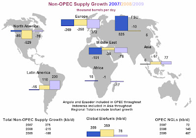
World Growth in Non-OPEC Supply of Oil
Note the “contribution” to supply growth from the United States
(Updated on 7/19/09)
Click the image to enlarge it:
Source: Click here
Click here for a great deal more detail and professional analysis
(from the June 11, 2009 report).
Click here for the most current release of that report.
3 comments:
> re: "World Growth in Non-OPEC Supply of Oil"
Does that classify oil taken out of the ground by China off the shore from Cuba as Asian oil or North American oil?
Just wondering. Is this where oil is taken out of the ground, or refined? Or something else?
> Re: World Growth in Demand For Oil
I think this is interesting is contrast to:
a) Everyone else -vs- USA
b) To the other graph by-continent of supply creation. A year from now we'll be using less oil. The same is not true for anyone else. We'll still be eating it, but others will be eating it even more.
OBH,
You raise a good question (re Cuba and China).
I have not found an answer to that question in the report. But, I’ve only read selected portions of it.
My guess would be that the chart merely shows how much oil was removed from which region without regard for what country removed it.
Post a Comment