Showing posts with label Climate Change - Atlantic Multidecadal Oscillation. Show all posts

Thursday, November 3, 2011

In October, Global Temps in Free Fall

In this post, I further substantiate my assertion that the (perfectly natural) Atlantic Multidecadal Oscillation has been the primary driver of global climate change over the last century.

Quoting Dr. Roy Spencer:
“The Northern Hemisphere, Southern Hemisphere, and tropics have all cooled substantially, consistent with the onset of another La Nina, with the tropics now back below the 1981-2010 average…

the temperature free-fall continues so I predict November will see another substantial drop in global temperatures…

taking a line from our IPCC brethren… While any single month’s drop in global temperatures cannot be blamed on climate change, it is still the kind of behavior we expect to see more often in a cooling world.”
Click the image & read the rest:
Click the image & read the rest
Click here to enlarge the image.

Quoting Dr. Roy Spencer again
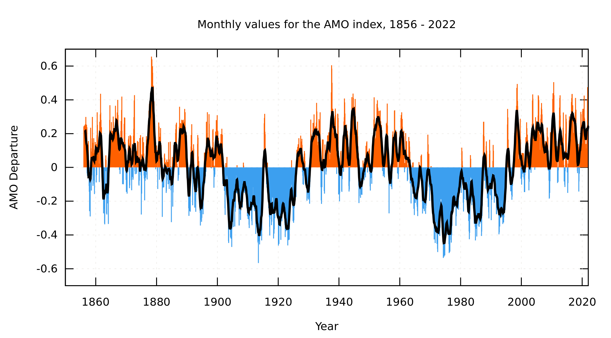
(describing the black line on the chart below):
“The 3rd order polynomial fit to the data (courtesy of Excel) is for entertainment purposes only, and should not be construed as having any predictive value whatsoever.”
Click the image & read the rest:

Click here to enlarge the image.

Now, in that last image, the black line may not (in Dr. Spencer’s view) hold any predictive value. But, it is a perfect fit with the AMO index for that period. Owing to the means whereby it is calculated, the black line lags the AMO index by pretty much exactly 10 years. In other words, the AMO index bottomed out in 1976 and peaked in 1998. The black line bottomed out in 1986 and peaked in 2008.

Click here and examine my assessment of how the AMO killed the CAGW cult.

Click here and examine how the newly released BEST data demonstrate that the AMO has been the primary driver of climate change over the last century.

If the AMO index remains consistent, why would we not expect global temperatures to continue to reflect the pattern of the AMO index? That would suggest a continued flat trend (in general) through about 2018 followed by about 30 years of substantial cooling.

Monday, October 31, 2011

The AMO Driving BEST Climate Change

Updated on 10/31/11
Located & cited actual calculated OLS liner trends.
I had previously eyeballed it from the OLS charts.
Changes were minuscule & conclusions unchanged.

This post documents that, once we correct for the Atlantic Multidecadal Oscillation, the newly released BEST data show an average global warming rate of 0.5C/100 years. This is identical to the multi-century NATURAL steady warming rate of “0.5°C/100 years” described by peer reviewed science (Akasofu, 2010).

The BEST data recently debuted with a firestorm soon erupting between the two co-authors of four BEST papers. In the preceding link it is suggested that the BEST data indicate “the planet has warmed by almost a degree centigrade since 1950”.

But, in the aforementioned firestorm, even Muller admits that:
“the BEST data suggested that world temperatures have not risen for about 13 years”
That observation leads Judith Curry to confirm she is accurately quoted to say:
“Whatever it is that’s going on here, it doesn’t look like it’s being dominated by CO2”
That caused me to ponder what the BEST data would show if we examined the exact same time frames I used in a previous analysis of the impact of the Atlantic Multidecadal Oscillation (aka AMO) on temperature trends in the USA. I did just that and arrived at the conclusion described in the first paragraph.

Here’s how I got there…

1950 to 2011
(The last data point available is 5/2010.)
The period accurately alleged to show a warming of 1C.
Click the image to enlarge it:
Click the image to enlarge it
Click here for the source.

But, what happens when our start & stop dates
are selected at similar points in the AMO cycle?


1913 to 1976
(The bottom of the two most recent AMO cooling cycles)
Click the image to enlarge it:
Click the image to enlarge it
Click here for the source.
Linear OLS trend = 0.0025558C/year (0.25558C/100 years).

1938 to 1998
(The peak of the two most recent AMO warming cycles)
Click the image to enlarge it:
Click the image to enlarge it
Click here for the source.
Linear OLS trend = 0.00745215C/year (0.745215C/100 years).

1925 to 1995
(The point where two AMO warming cycles cross the baseline)
Click the image to enlarge it:
Click the image to enlarge it
Click here for the source.
Linear OLS trend = 0.00508102C/year (0.508102C/100 years).

The average warming rate for these three samples is 0.5C/100 years. Again, this is identical to the multi-century NATURAL steady warming rate of “0.5°C/100 years” described by peer reviewed science (Akasofu, 2010).

Click here & see how the AMO killed the CAGW cult.
Click here for some basic climate change science.
Click here to debunk the hysteria topic by topic.

Saturday, October 22, 2011

The AMO as a Driver of Climate Change

Updated on 10/22/11 at 10:29PM MST
Added a fourth chart.

The following primarily deals with the impact of the Atlantic Multidecadal Oscillation (aka AMO) on temperature trends in the USA. Click here to examine the global impact. Click here to examine the USA impact in more detail.

I have previously asserted that any honest analysis of temperature trends must begin and end at similar points in the AMO cycle. This is particularly true for USA temperature trends.

Global warming hysteria mongers frequently claim that the warming of the last 30 to 35 years was primarily caused by humans. But, when examining USA data, if one simply insists upon looking only at trends which begin and end at similar points in the AMO cycle, that much hyped warming (human induced or otherwise) virtually disappears.

The following charts show that -- from 1913, forward -- there is virtually no USA warming which cannot be explained by AMO warming cycles. So, if humans are warming the entire planet at a catastrophic rate, why -- once we correct for the AMO cycles -- is this not evident in the USA?

In the following three charts, I have selected beginning and ending dates based upon a Wikipedia chart of the AMO index and (more precisely) the raw data from NOAA from which that chart was derived.

Click here to reproduce each of the charts below.

1913 to 1976
(The bottom of the two most recent AMO cooling cycles)
Click the image to enlarge it:
Click the image to enlarge it
The trend rate is 0.01F per decade
(0.1F per CENTURY).


1938 to 1998
(The peak of the two most recent AMO warming cycles)
Click the image to enlarge it:
Click the image to enlarge it
The trend rate is 0.05F per decade
(0.5F per CENTURY)

0.5F per century is about HALF the:
trend rate of 0.5°C per century since… the 1700s

1925 to 1995
(The point where two AMO warming cycles cross the baseline)
Click the image to enlarge it:
Click the image to enlarge it
The trend rate is 0.00F per decade
(0.0F per CENTURY).


Not covered in the above 3 charts is 1998 to 2010.
The chart shows an AMO cooling phase for that period.
And, surprise, surprise -- so do USA temperatures.
Click the image to enlarge it:
Click the image to enlarge it
The trend rate is -0.95F per decade
(-9.5F per century).

Time for a global cooling panic? No!
Just a brief cooling phase -- nothing unusual
(just like the brief warming phase which preceded it).

So…
The IPCC tells us that human activity has been the primary driver of temperature trends over the last century. But, the data make it perfectly clear that the AMO has been the primary driver of temperature trends over the last century -- especially in the USA. I submit to you that the AMO will continue to be the primary driver of climate change over the next century as well.

Click here for some basic climate change science.
Click here to debunk the hysteria topic by topic.

Friday, October 21, 2011

Orbach Trips Over the AMO & Fails to See it

Updated on 10/22/11 at 11:09AM MDT
An additional timeframe analysis was added.
Post was reworded for clarity & consistency.

In a prior post, I destroyed a letter to the Wall Street Journal editor sent in by CAGW apologist Raymond L. Orbach. The perfectly natural AMO warming cycle was the foundation for that debunking.

The most recent AMO warming cycle began around 1976 and peaked around 1998. Now, we see a quote from Orbach himself wherein he stumbles upon the AMO warming cycle and still fails to see it.

Quoting Raymond L. Orbach:
“When I started looking at literature, I noticed that there was warming beginning in 1980”
Quoting the so-called “journalist”
who wrote this purely political propaganda piece:
“The National Oceanic and Atmospheric Administration reports that temperatures across the United States have increased by 1.5 degrees since the 1970s.”
True enough. Click here and chart NOAA annual data from 1975 through 2010. You’ll find a trend rate of 0.51F per decade over a period of roughly 3 decades and you can reasonably reach the same conclusion.

But, the time frame of 1975 through 2010 is egregiously cherry picked. It begins around the bottom of an AMO cooling cycle and ends around the top of an AMO warming cycle. Furthermore, click here and see that peer reviewed science finds “an estimated warm bias of about 30%” in the NOAA data (meaning the actual temperature increase over this cherry picked timeframe is more like 1.05F).

Any reasonable trend analysis would have to begin and end at a similar point in the AMO cycle. In each analysis below, I have selected start dates and end dates which reflect similar points in the AMO cycle based upon a Wikipedia chart of the AMO index and (more precisely) the raw data from NOAA from which that chart was derived.

An AMO cooling cycle bottomed out in 1913. The most recent AMO cooling cycle bottomed out in 1976. Click here and chart the annual average USA temperature over that time frame (1913 to 1976). You’ll find a CAGW busting trend rate of 0.01F per decade!

An AMO warming cycle peaked in 1933. The most recent AMO warming cycle peaked in 1998. Click here and chart the annual average USA temperature over that time frame (1933 to 1998). You’ll find a CAGW busting trend rate of 0.01F per decade!

Between these two extremes, let’s pick equivalent moments when the AMO cycle crossed the baseline in the chart. Start at 1925 (when an AMO warming cycle crossed the baseline) and end in 1995 (when the most recent AMO warming cycle crossed the baseline). Click here and chart the annual average USA temperature over that timeframe (1925 to 1995). You’ll find a CAGW busting trend rate of 0.00F per decade!

Finally, let’s compare the AMO warming cycle timeframe of the last 3 decades to the previous AMO warming cycle. An AMO warming cycle began in 1913 and peaked in 1933. Chart the average annual USA temperature over that timeframe (1912 to 1934). You’ll find a trend rate of 0.56F per decade (slightly higher than the 0.51F per decade figure cited by our so-called “journalist”).

Click here for some basic climate change science.
Click here to debunk the hysteria topic by topic.

Wednesday, October 12, 2011

Debunking Raymond L. Orbach's CAGW Letter

Updated on 10/13/11 at 1:16PM MDT to include more info.

True believers in the catastrophic man made global warming myth seem impressed by a letter to the WSJ editor by one Raymond L. Orbach. So, let’s debunk it:

1) Orbach’s central point is that satellite data show a warming trend over the last 30 years. True enough (thanks to the most recent -- perfectly natural -- AMO warming cycle). Carefully examine that link in it’s entirety and you’ll find all that is necessary to fully debunk Orbach’s letter.

Notable in that debunking is the fact that the longer term trend shows the planet has, for hundreds of years, been naturally warming at a steady trend rate of 0.5°C per century -- a full order of magnitude LESS than the (not at all unusual) 30 year AMO driven trend touted by Orbach. What follows is just (some very tasty) icing on the cake.

2) Orbach cites a paper allegedly claiming that a trend of at least 17 years is required “to detect overall trends.”

I have a theory as to how that (odd) number was calculated -- pretty simple really:

A) NOAA is on record stating:
“The trend in the ENSO-related component for 1999–2008 is +0.08±0.07°C decade, fully accounting for the overall observed trend. The trend after removing ENSO (the "ENSO-adjusted" trend) is 0.00°±0.05°C decade.”
2010 was an El Nino driven warm year (part of the ENSO variations). Hence, the satellite data demonstrate that the ENSO-adjusted flat trend continues (making for 13 years without any global warming).

B) Phil Jones (of ClimateGate infamy) is on record stating that there has been no “statistically significant” global warming since 1995 (16 years ago). That assessment, by the way, met NOAA’s 15 year standard for invalidating all the IPCC computer models (see the link for substantiation).

So, is it mere coincidence that 17 years is now determined to be the (revised) magical number? You decide.

3) The nature of climate change is that there are countless natural cycles embedded within other natural cycles (which, in turn, are embedded within still more natural cycles). Human activity has probably contributed some very tiny (and utterly inconsequential) amount of warming. But, the fact is that there is nothing about current temperatures or current trends which is even remotely close to falling outside the bounds of natural variations.

Truth is, the warmists always want us to examine only their carefully cherry picked date ranges (and ignore all others). They are particularly keen on making sure we never look as far back as the previous (perfectly natural) interglacial warming period (much less the 3 very similar warming periods which preceded that one). Yeah, the data from those Vostok ice cores are particularly “inconvenient”, eh?

Click here for some basic climate change science.
Click here to debunk the hysteria topic by topic.

Saturday, December 4, 2010

How the AMO killed the CAGW cult

Updated 10/24/2011 to include a quote from Dr. Richard Lindzen.

Quoting M.I.T. Climatologist Dr. Richard Lindzen
(Emphasis mine & I inserted the link):
“The motions of the massive oceans where heat is moved between deep layers and the surface provides variability on time scales from years to centuries. Recent work (Tsonis et al, 2007), suggests that this variability is enough to account for all climate change since the 19th Century.”
The Tsonis paper covers a wide range of ocean driven climate cycles. Included among the cycles is the North Atlantic Oscillation. Not included is the Atlantic Multidecadal Oscillation (the ocean cycle I explore below).

If one looked for a single factor explanation for the rise and fall of the CAGW religious cult (and the Global Cooling cult which preceded it), the AMO (Atlantic Multidecadal Oscillation) would be a very good candidate.

Click here and here for published science consistent with this view. Also consistent with this view is this chart taken from this published science (detailed in a previous post).

Examine the AMO chart of rising and falling ocean temperatures.

Click the image to enlarge it: Click the image to enlarge it  
Click here for the source.
Ultimate data source is this file from this page.

In 1934, the continental USA experienced the hottest year on record. That warm period closely correlated with an AMO warming cycle (see the graph above).

In 1975, the world was 30 years into a cooling trend closely correlated with AMO cooling. That was the year that Newsweek swore we would all freeze to death unless big government came to our rescue.

In 1988, the world was one decade into a warming trend closely correlated with AMO warming. That was the year James Hansen testified in front of Congress and started the CAGW hysteria cult.

By 1998, the AMO warming cycle peaked and plateaued. Coincidentally (or not), the alarmists at NOAA admit there has been no global warming since 1998:
“The trend in the ENSO-related component for 1999–2008 is +0.08±0.07°C decade, fully accounting for the overall observed trend. The trend after removing ENSO (the "ENSO-adjusted" trend) is 0.00°±0.05°C decade.”
Peer reviewed science suggests that -- owing to the AMO -- there will be no global warming through 2018.

A simple examination of the chart above suggests that global temperatures will probably be generally flat through 2018 (at which point we’re likely to see another dramatic cooling trend such as the one which started around 1945 and, circa 1975, caused alarmists to declare we were all going to freeze to death -- unless big government stepped in to save us).

The question is… By 2040, will tomorrow’s climate charlatans try to convince us we will all freeze to death unless big government steps in to save us? Do you really need to ask?

Click the image & see how these AMO cycles
fit into a larger (and very gradual) warming trend:
Click the image & see how these AMO cycles fit into a larger (and very gradual) warming trend
This chart is copied from Akasofu, 2010.
The associated post was authored by Dr. David Evans.
Click here to further validate Akasofu’s conclusions.

Owing to Milankovitch Cycles, the day will come when 1,000 foot tall glaciers once again cover what is now New York City. But, mercifully, that day is probably about 50,000 years away. In the meantime -- driven by various other shorter term natural cycles -- temperatures will continue to rise and fall and the climate will continue to change (as it always has). But, relatively speaking, we will continue to enjoy some of the most stable climatic conditions the world has ever known.

Click here for some basic climate change science.
Click here
to debunk the hysteria topic by topic.
Hot Topics:

BEST Data - No Warming Over Last Decade
The AMO as a Driver of Climate Change
Fact check - The wealthy already pay more taxes
Rare Earth Elements Spell Doom for Green Fantasies
Wikipedia’s Climate Doctor
ClimateGate - The latest updates
Dr. Tim Ball on ClimateGate - The end of AGW hysteria?
ClimateGate: The Musical - Hide The Decline!
Lindzen and Choi SHATTER the IPCC Computer models!
It’s OFFICIAL! We HAVE elected our own Hugo Chavez!
Health Care “Reform”
Cap & Trade - It’s just a giant tax (on EVERYBODY)
The Radicals in the White House
ACORN - The truth
Transparency - Obama promised it. So, where is it?
The Cause of the Housing Debacle
Fiscal Responsibility - In Obama’s Fantasy World
Atlas Shrugged: From Fiction to Fact in 52 Years
Iraq War Media Deceptions 101 - Why the Iraq invasion was justified and necessary
Climate Change 101 - Learn what the SCIENCE says about the biggest hoax EVER!
Obama - on Climate Change
Obama’s Climate Czar - The most dangerous politician in the United States
Obama’s Climate Czar - Her Socialist revolution has begun
Compare the current recession to previous recessions
Obama - Historic & Catastrophic!
Is Obama a Socialist? You BETCHA!
Makers & Takers - Spread the wealth
Obama = International Crisis
The economic case against Obama
The comprehensive case against Obama
The deficit case against the Dems
A Liberal Supermajority? Watch Out!
Examine the series you should have read before voting!
Maggie’s Totalitarian Political Religion
“Kill him!” - Just another media lie?
Journalistic Integrity? - WHERE?
The post about the TED Spread
Save the nation from the Entitlement binge!
Market Reaction to $700 Billion Bailout Vote
Drill Here, Drill Now - Quantitative Facts
ANWR - Drill There, Drill Now
ANWR Matters - Here’s why
Coal Liquefaction (Liquid Fuels From Coal)
The Ethanol Debacle
Pickens Plan - Don’t Fall For it!
Energy Tomorrow Radio - GOOD Stuff!
Economic Forecast
Iraq
Obama
More…

Labels

Blog Archive