“Entering the gallery housing the American Museum of Natural History's new exhibit on global warming, visitors immediately come upon a 60-foot-long panoramic illustration detailing technological advances of the past 400 years.
Running through this wall-based collage is a red, light-emitting diode — it looks like a neon tube — that tracks the levels in carbon dioxide in the atmosphere from 1600 to the present.”
“Atmospheric carbon dioxide in 1660 — an estimated 274 parts per million. The year 2000 369 ppm. Point made.”

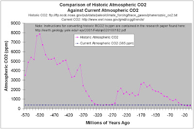
Here is a chart you will NOT find in this exhibit.
Click the chart to enlarge it:

I created the above chart.
A current CO2 level of 385ppm was taken from this NOAA page.
Historic CO2 levels were taken from the following peer reviewed science:
R.A. Berner, 2001 (GEOCARB III), as published in the American Journal of Science, Vol. 301, February 2001, P.182-204.
The raw data from the above peer reviewed science was taken from this file downloaded from this NOAA page.
I followed the instructions contained in Geocarb III for translating RCO2 into ppm.
The following chart takes the same peer reviewed science and overlays temperature data derived from The Paleomap Project by Dr. C.R. Scotese, a PhD geologist at the University of Texas at Arlington.

Note: The above chart somehow calculated lower CO2 levels than I did.
But, I followed the instructions contained in Geocarb III to the letter.
Now, look back 460 million years ago and explode the MYTH that we are on the precipice of some mythical “tipping point” of unstoppable and catastrophic global warming. The FACT is that the Ordovician Ice Age climate was very similar to THE CURRENT ICE AGE!
No comments:
Post a Comment